Babymoov
Touchscreen babyphone — standard design study
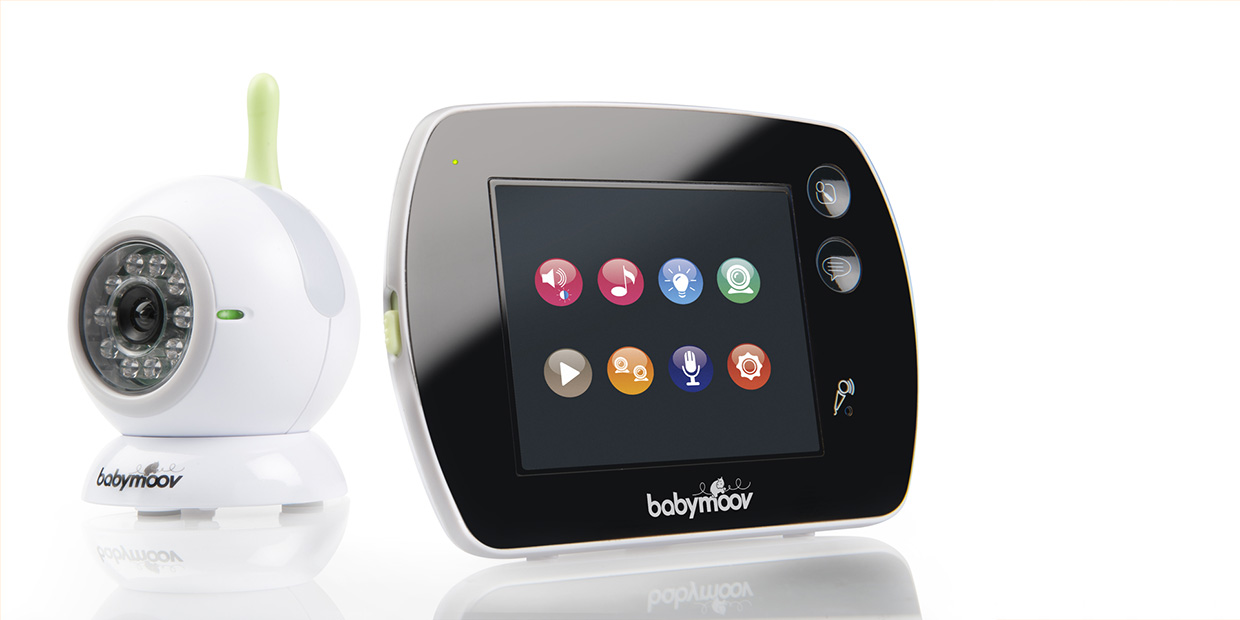
Babymoov, French leader in baby monitor market thanks to an audio high performance range, wanted to launch a new ultra innovative model to maintain its leading position and increase its expert image on baby monitors. Innovation focused on the “Touch Screen” technology, combined with a design made to highlight the very innovative nature of the product: modernity, simplicity of lines, ultra flat front cabinet, sleek design. This new generation of baby monitor can control up to 4 cameras, activated remotely, have a night-light and a lullaby, a programmable motion detector, a temperature indicator and has a Wifi signal range of 250 meters.
Backstage of the project
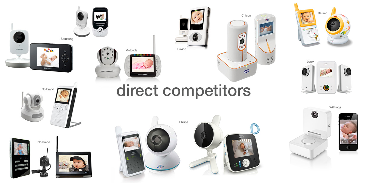
Competitors’ trend analysis
Babymoov is well positioned in the market for low-end baby monitors. The high-end offer is more competitive with new brand coming on the market, issued from the phone market (Samsung, Motorola), offering models whose design are inspired by mobile phones with high technological added value.
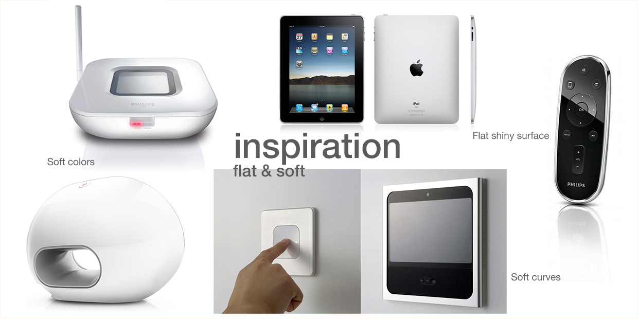
Project trend positioning & Technology choice
Conciliate soft and reassuring shapes with high-tech products’ seriousness. Glossy black flat front cabinet, (like iPad) and white curved back cabinet, following the shape of the hand, with a matte non-slip treatment. Soft colors.
The initial selected touchscreen technology was of capacitive type (screen covered with a glass surface, like the iPad, to give a feeling of flat surface to the entire front of the product). Finally, the technology used was of resistive type, which did not allow the product to show a front made of one surface (the screen could not being covered with a full glass surface). It was therefore necessary to adapt the design to give minimal visual impact to the screen display glass and front cabinet.
Technical, cosmetic & first shooting samples follow-up
-Verification & validation of engineers’ CAD files from design point of view.
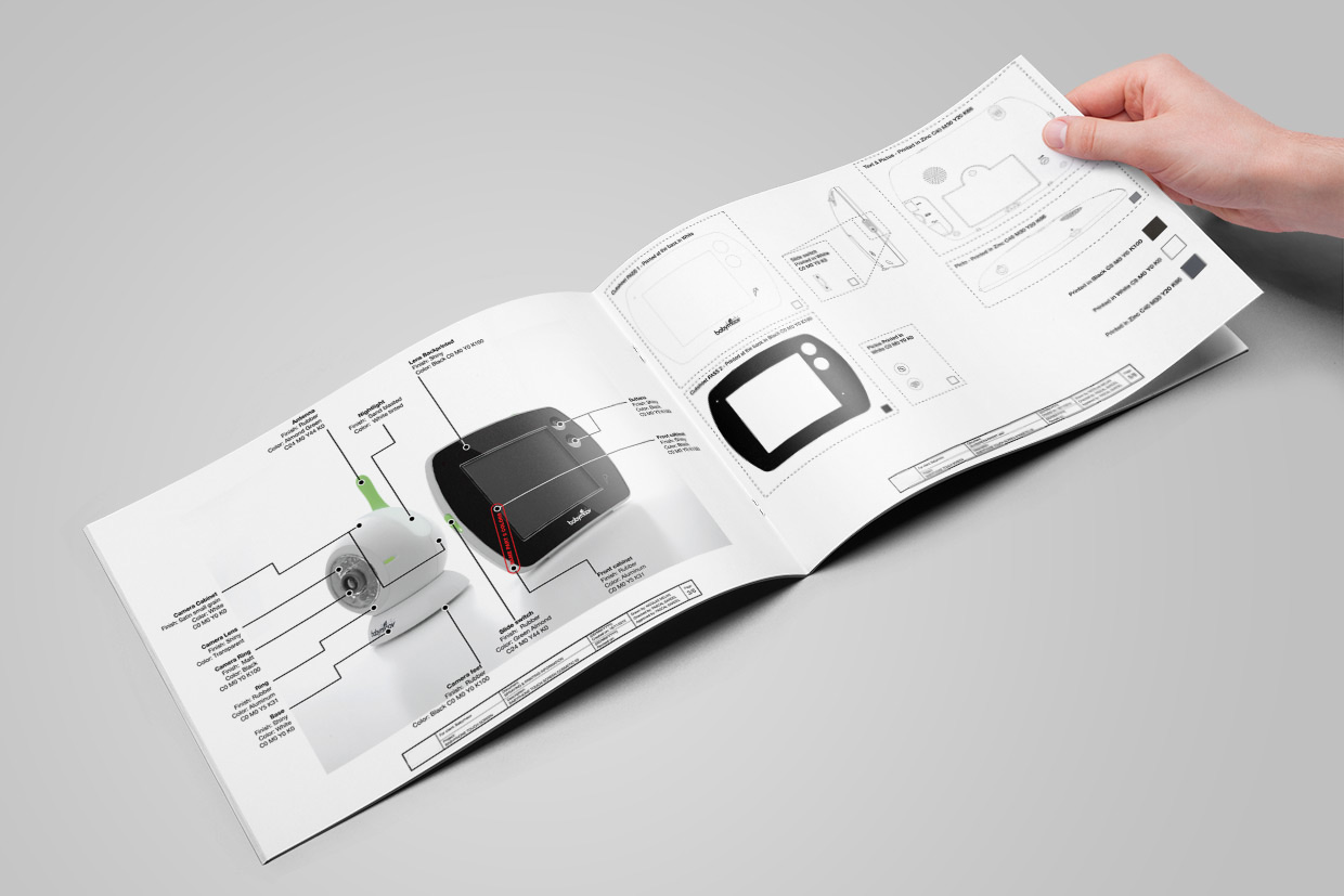
-Management of size, color references and exact placement of printings (logos, pictograms, functions, fonts…) on the product,
-Creation of the silkscreens files for all product’s parts (document mandatory for production),
-Materials of each parts of the product (choices made by engineers and reported by us),
-Color references of each parts of the product (Pantone, CMYK, DIC…),
-Description of surface finishes of each parts of the product,
-Aspect of all parts of the product (materials and finishes),
-Accuracy of colors of all parts of the product,
-Aspect and positioning of the printings of all parts of the product,
-Quality of assembly, cinematic, sound quality of the product,
-Consistency and overall perceived quality of the product.


